BACK
The Problem
Managing 25 products, 4 platforms, 5 brands, 21 teams, and 120+ contributors with no shared design language was unsustainable. An audit revealed 7 different versions of brand colors and 4 conflicting typefaces scattered across products. Without a clear governance model, the inconsistency was only going to compound.
Three goals for the project
Consistency – Establish a shared design language and single source of truth across all products and brands
Scalability – Build a structure that could grow with the organization without becoming a bottleneck
Autonomy – Allow product teams to contribute and innovate without depending on a central team for every decision

A Federative Governance Model
Rather than choosing between full centralization (which would flood the DS team with requests) or pure anarchy (which had already caused serious problems), we designed a federative model — distributed ownership built on a shared foundation.
The system was structured as three layers: Foundations housed all primitive elements and a token system supporting 10+ themes across 5 brands. Platform Libraries collected shared components reusable across products on the same platform. Product Libraries were owned and driven by product teams themselves, giving them room to build what they needed without waiting on a central team.

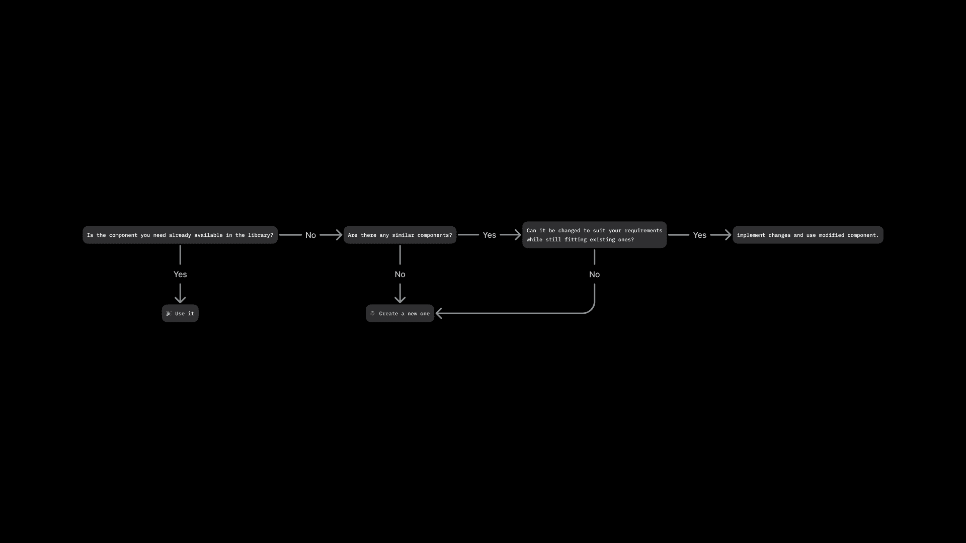
Contribution API
To make product team contributions structured and consistent, we created the Contribution API — a detailed guide covering every step of the process. It started with a decision tree: use an existing component, modify it, or build a new one. From there, it walked designers through research, cross-team syncing, design, documentation, and a component readiness checklist before anything could be merged.
This meant the third layer of the system could grow organically, without sacrificing quality or coherence.
Component Life Cycle
Alongside the Contribution API, we established a Component API — a clear standard defining how components should be built and what criteria they needed to meet before being published in any shared library. This gave all 120+ contributors a common bar to work toward, and gave the DS team a reliable way to review and approve contributions without becoming a gatekeeper.
Results
50% reduction in time to market, freeing product teams to focus on user experience rather than rebuilding UI from scratch.
50% design system adoption rate across products within the first year.
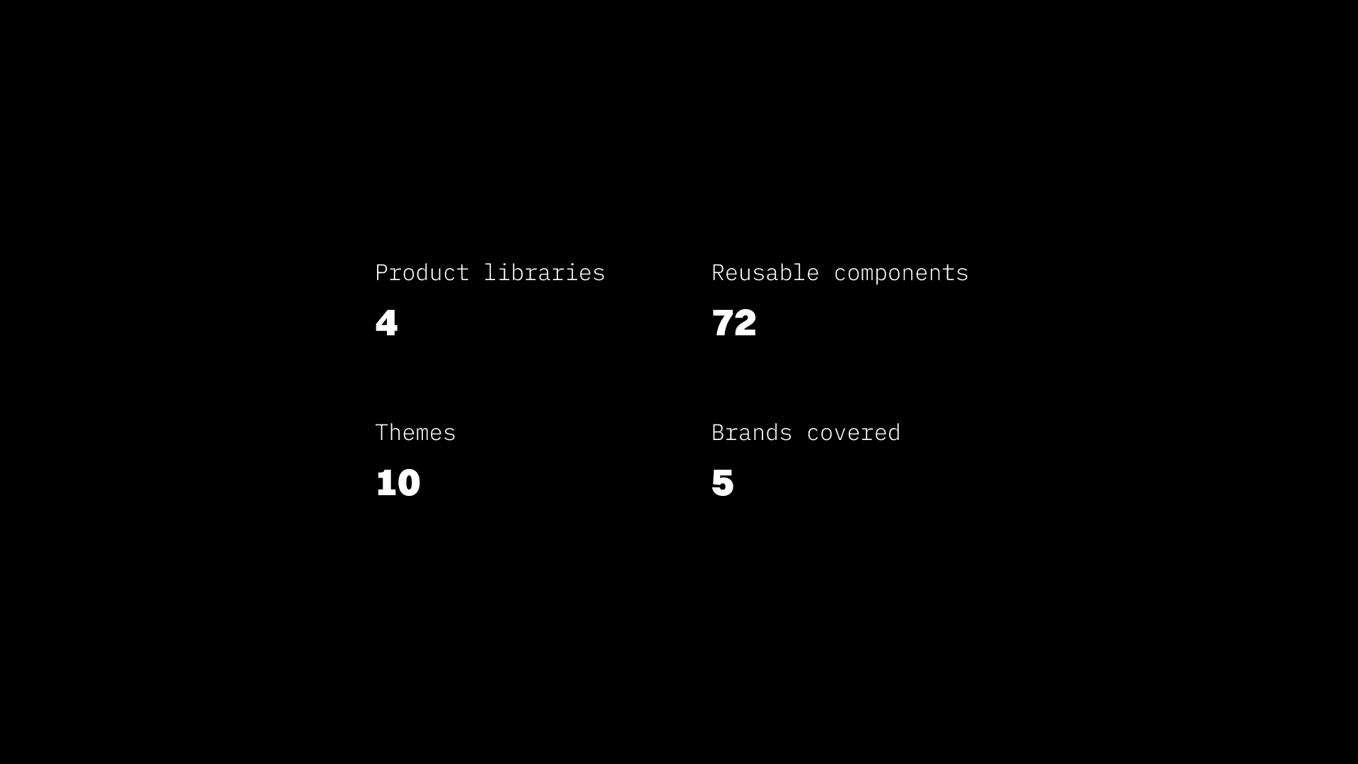
4 libraries shipped with 72 reusable components and a fully functioning token system covering 5 brands.
Transformed siloed, competing teams into active collaborators with a shared design language.
Read more